Analyze responses
Dig deeper into your user feedback with pre-built reports.
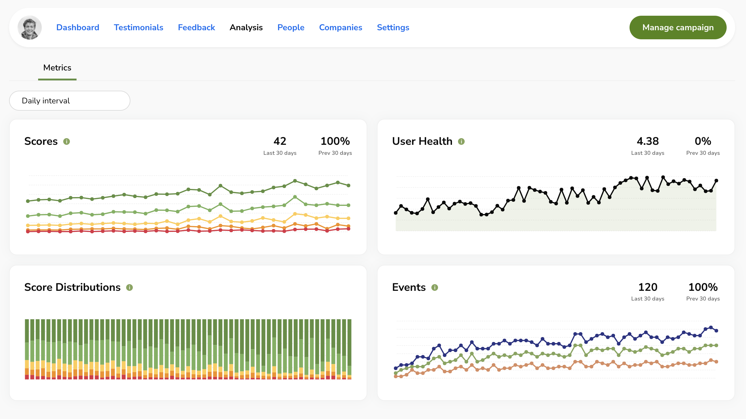
Visualize your user feedback on the Analysis page in the RateHighly dashboard.
Metrics show your Scores, User Health, Score Distributions, and Events.
You can show the statistics grouped by daily, weekly, and monthly intervals.
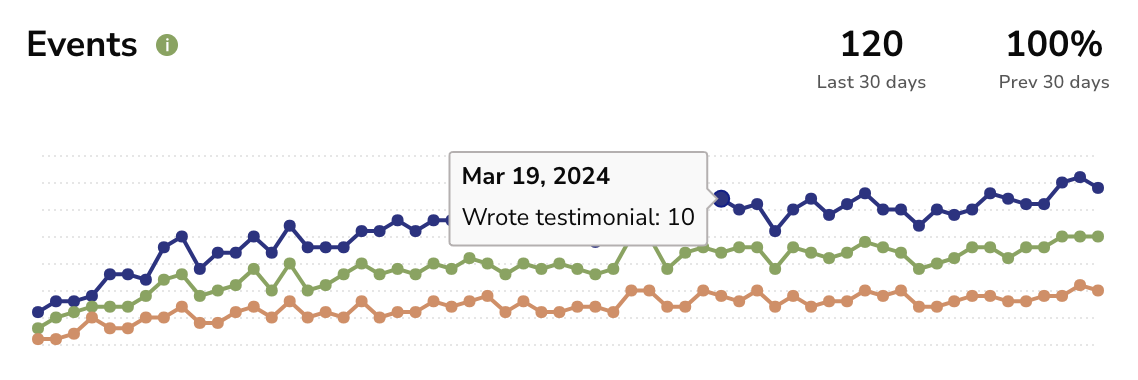
Each metric shows more detail when hovering over data points.
Metrics
Scores
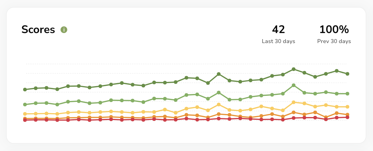
The Scores metric shows the total users that responded with a particular score (for instance 10 users rated highly yesterday).
The Last 30 days statistic shows how many users gave a rating in-app over the past 30 days (i.e. 42 people gave a rating over the past 30 days).
The Prev 30 days statistic shows how much this statistic has increased vs the previous 30 day period (i.e. we received twice as many responses this month vs last month).
User Health
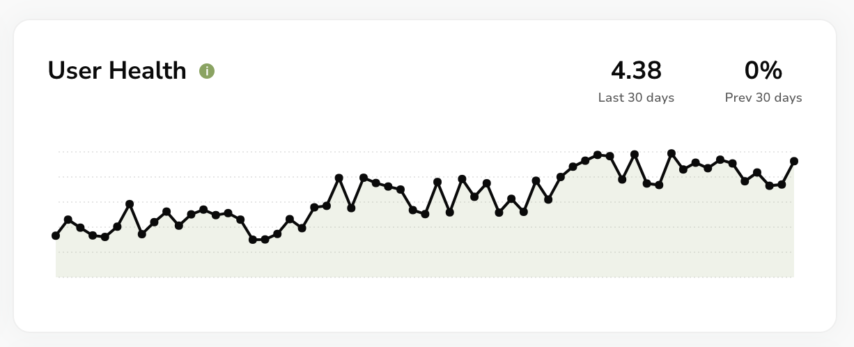
The User Health metric shows a 30-day rolling average of user ratings. This is a high level indicator, like an NPS score, which tells you how happy your users are with your app. The maximum value is 5 and the minimum is zero. A good user health score is 4 and above.
The Last 30 days statistic shows the average score of the past 30 days (i.e. users on average gave a score of 4.38 this month - this is great!).
The Prev 30 days statistic shows how much this statistic has increased vs the previous 30 day period (i.e. it didn’t change this month).
Score Distributions
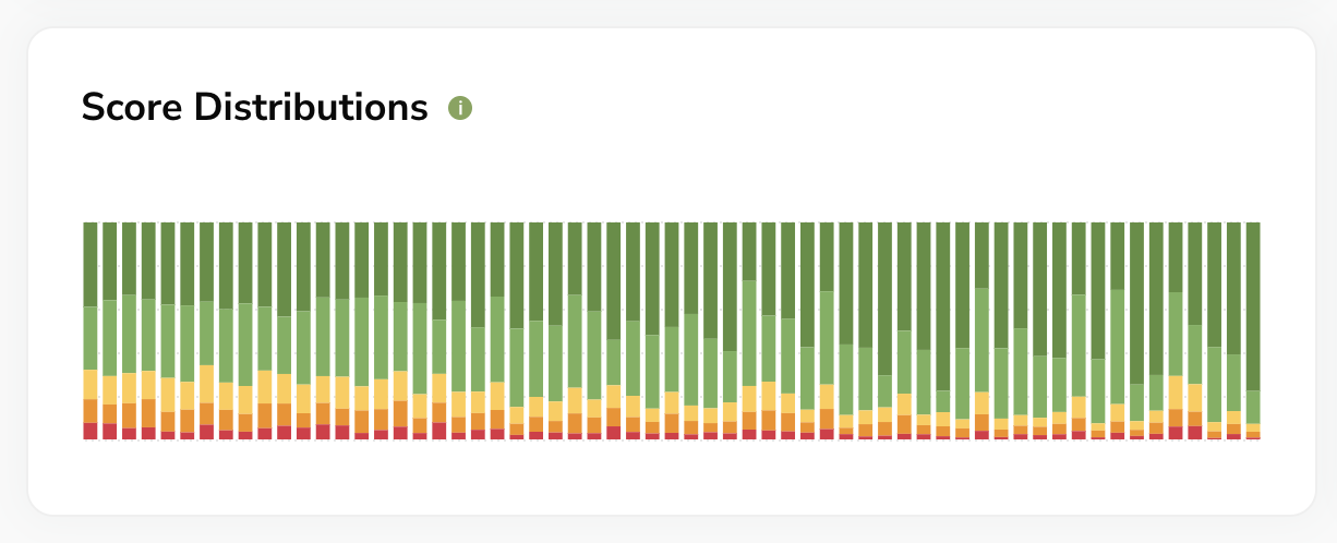
The Score Distributions metric shows the percentage of users who gave each rating. For instance, 70% very happy, 20% happy, 5% neutral, 3% unhappy, and 2% very unhappy.
Events
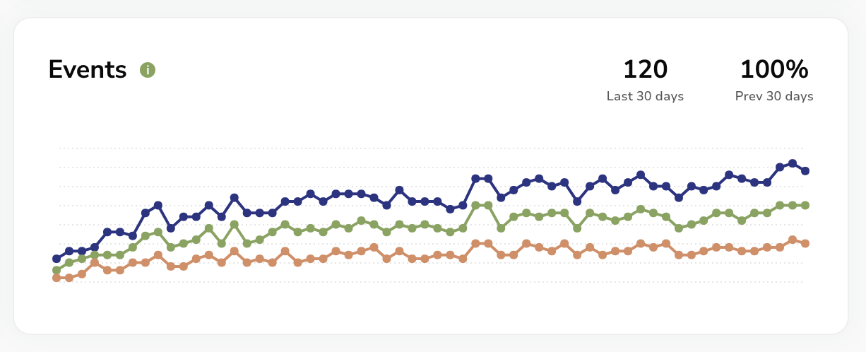
The Events metric shows the count of particular events such as wrote a testimonial, gave rating, and gave feedback.
The Last 30 days statistic shows the total events over the past 30 days, and the Prev 30 days statistic shows how much this statistic has increased vs the previous 30 day period.
